Thursday, March 24, 2011

Mother's Day and Livestream

I disappeared for a while, I know. Part of that was Spring Break last week, and this week I've been all over Dragon Age 2. It's been a lot of fun. But there are a couple updates to make.

I've started a new painting. It's a Mother's Day gift for my grandma, commissioned by my mom. We've still got a while before Mother's Day comes around, but I wanted to get the brunt of it done last week while I was babysitting. Ignore the hair blob. It's just a placeholder. It's not even the right color. I think I have more work to do with the face and eyes, too. For some reason it just feels very unnatural. Give me some time; I'll work it out. Most likely, it's because I've had to fill in a lot of details from my own imagination because I'm working from a blurry black and white photograph.

Also, I have a Livestream account and this painting was the first (successful) test. So you can watch the process of the whole thing here, if you've got six hours laying around. And if you don't, you can skip around. I apologize for the Pokemon and conversations with an 8 year old going on in the background... like I said, I was babysitting at the time, and I didn't realize when it was on screen view it would still record audio. And again, it's unfinished. Expect more later.

Sunday, March 6, 2011

Speedpainting: Dia Frampton

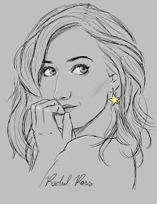
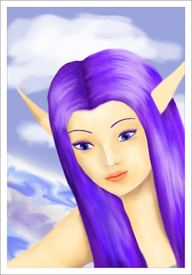
Tonight as I was browsing I came across some fantastic concert pictures of Meg and Dia in concert. In the face of an unfinished presentation for class first thing in the morning, I knew I had to at least give a whirl at a quick painting.

Ultimately, everything went better than expected. To date, every painting I have ever attempted without laying down a sketch first has resulted in disaster. This painting began to head south once I tried painting her other eye which was half hidden in shadows and hair, so I cropped it in real close to what I had finished and called it done. That means this picture is significantly smaller than what I'm used to producing, but oh well. I'm really happy with how it turned out, and I think I'd like to experiment further with alternative color schemes. They're just so expressive and fun.

Also, Blogspot won't upload my picture for whatever reason, so you're going to have to deal with a small thumbnail. If you click on it you can see the full size. Enjoy!

Wednesday, March 2, 2011

Amanali Mahariel.

Elfelfelfelfdalish.

So, continuing my Grey Wardens project, here's number 4 out of 7 (that last number is subject to change... depending on how much fun I have with this). Honestly, I don't love the picture. I think the composition is boring, and I really didn't capture the smirky goodness the way that I hoped to. Instead it just looks like... a weird studio portrait. Y'know. Of an elf with tattoos on her face.

Speaking of the tattoos! They're just so much fun to paint. That's why all of my characters have facial tattoos. IMHO most of them are pretty ugly in game, but with this style of art they look great and they're my favorite part of the drawing process.

Other things. I'm proud of the shirt and the shading, and I'll bet you didn't even notice it. I was worried about how I would pull off the hair style with the weird little pieces. With any other color that would be easy, but black obscures form. So. I didn't quite use black, but almost black. That way I could include some subtle shadows. Did I mention the tattoos were fun?

Stock reference. ZOMG Star Trek to Dragon Age. Who knew?

Other Wardens: Apollo Cousland, Rhea Amell (black and white), and Skadi Aeducan.

Tuesday, March 1, 2011

Apollo Cousland and an update on Rhea.

Well! Yesterday I drew Apollo Cousland (his dog is named Husker- hur, hur, hur), which means I'm on track for drawing one Grey Warden a day. 6 1/2 hours on this one, so not as fast as I would like, but still.

Muscles. Interesting challenge, and I think I did alright with it. Hair was also a challenge, since it was largely without a reference. I'm happy with the shading, not as happy with the braid. But I couldn't figure out how to make it look better. :/

A bit about Apollo: Very much your typical budding lordling. Charismatic and talented in many different fields, he comes across to most as an exemplary human being. However, being raised faithful to the Chantry he has an inherent distrust for magic. He also loathes the lower classes, and often exhibits cruelty or a snide attitude towards them. Even though ultimately he will do the right thing (and be seen by many people doing it, of course) he will occasionally fight dirty to get his way.

I've sort of shipped him and Rhea in my mind.

These are the references for the head and the body.


Also. The night after I drew Rhea I realized to my everlasting horror that she was supposed to be black and I forgot. So. I fixed it yesterday. Allow me to present: what Rhea REALLY looks like! XD


Other finished Grey Wardens: white Rhea Amell, Skadi Aeducan, and Amanali Mahariel.

Sunday, February 27, 2011

Rhea Amell

I have a problem. Every time I start a piece I think it'll take me two or three hours. No. It doesn't turned out that way. Seven hours on this today. Sigh.

Anyway. This is another Dragon Age fan art, my human mage Grey Warden. I've kind of been on a Warden-making spree the past couple of days, and it's really been a lot of fun. Naturally, I want to eventually draw all of them, just for the pride of it. 4 out of 7 done (the others being Skadi Aeducan, Apollo Cousland, and Amanali Mahariel). I'd like to hope I can do them all this week, but considering the amount of time this one alone took, that's not a very realistic goal. Still, we'll see.

This was an unusual approach for me, and honestly, I had no idea what I was doing. I started it as a drawing, but wanted it to be more than just grayscale, so I added color. I didn't want it to turn into a painting, so I did the next best thing: a poor attempt at cell shading. I'm brand-spanking-new to the technique, so if anyone would like to give me critique or pointers, I would be grateful. Obviously, the hair went a little overboard. Still, I'm happy with the way it turned out. And the eyes and teeth are just plain painted. Other than that... yeah. Not sure what else to say. Help plz.

Reference image.


(The following may not make much sense if you haven't played the game.) A little bit about Rhea Amell: angry Chantry-hater sums it up pretty well. She's always resented her captivity within the Circle and believes that magic should be free in all its forms- including Blood Magic. Naturally, she has trouble getting along with anyone who frequently exerts their faith in the Maker. She's not afraid of doing the wrong thing for the right reasons, and has a lot of compassion for underdogs who live by that same code. She was thrilled to join the Wardens for the chance to live free of the Chantry, and is fiercely loyal to her new calling.

Watch for more Wardens. <3

Saturday, February 26, 2011

What has it been up to?

Weeks of silence. Ominous indeed.

Actually, I've just been focusing my attention elsewhere. Mostly on Dragon Age and Dragon Age fandom, but there's been a little more lomography too. I haven't produced anything stellar, but here are the scraps I have done.

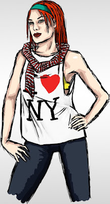
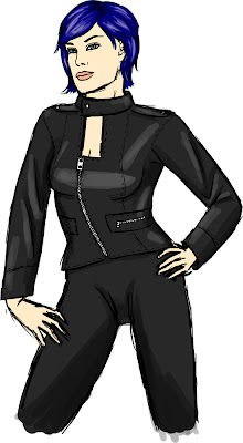
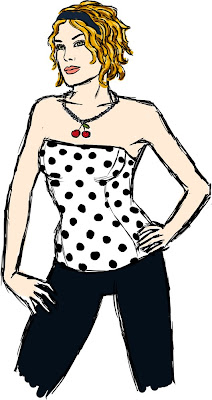
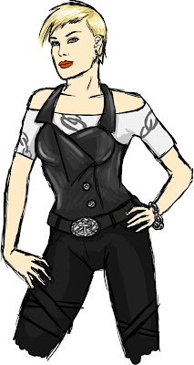
First up on the queue are some redesigns of Sabrina Shepard, the main character of a story I will probably chip away at very slowly for years to come. I wanted something more distinctive and less emo goth. There's nothing here I'm going to stick with, except for the red hair/headband. Nevertheless, it was a good exercise. The first one was practice with clothing and folds, as well as a messy little cell shading technique I may pursue further.


The next piece is some Dragon Age fandom I'm not very happy with. At all. It's a mess that reminds me of my work from five years ago. The background was an accomplishment, though. I'm terrible at backgrounds, and apart from all the architecture being crooked, this didn't turn out too bad. It was also my first real try at cell shading, which is strange because I believe most artists start with cell shading and from there learn to paint. For me it was the opposite, which made this difficult in an awkward way. Practice, practice...


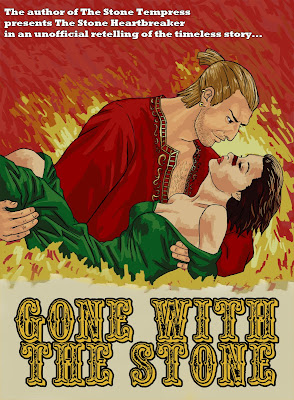
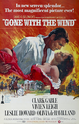
This last piece is just silliness. On the Bioware Social Network in the Varric fan thread somebody made a connection between Varric and Fabio and suddenly artists started producing mock romance novel covers featuring Varric as a Don Juan protagonist called The Stone Heartbreaker. So naturally, I had to make my own contribution. As I said, silliness. I'm proud of the way it turned out regardless.


And that's all! Hopefully I will get back to being productive soon. That will probably be around March 8th when Dragon Age 2 comes out and I am unable to buy it. I will drown my sorrows in art.

Tuesday, February 8, 2011

Lomography

Okay, so when I started this blog I decided I wasn't gonna put any photography... but screw that.

I haven't really drawn anything for like a week. Or half a week that has felt like a week. I had a ton of work build up for my classes that I just couldn't ignore anymore... also, Dragon Age 2 marketing has ramped up a ton in the last two days, so I've spent a little more time obsessing over that than I should have (but really... hot dayum).

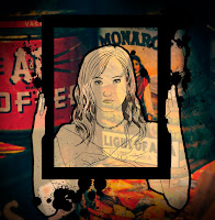
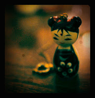
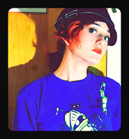
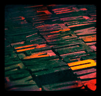
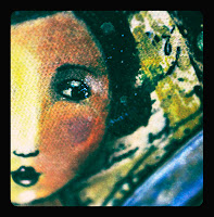
Anyway, suffice to say I haven't been able to commit myself to the 3-6 hours it takes to do a drawing, let alone a finished piece of work. Instead I've been doing little ten minute slices of lomography style editing in Photoshop. Lomography, for those who aren't aware, is the style of photography that embraces imperfection and a more casual approach to shooting. It imitates the look of retro film cameras. It probably won't amount to anything, but I think I've got some pretty interesting shots here. Including two experiments: one with my frame drawing placed over the lomography, and another paint dribble type thing that suddenly came to me as I was writing this (the latter not being so much a finished work as an inspiration blurb I didn't want to forget).


Tuesday, February 1, 2011

MaD T-Shirts (pt 4)

Yeah, it's another one. I spent considerably longer on this one than the others (twice as long, probably? 6 hours is my estimate) because of the complexity of the image. I really like how it turned out, though, especially with the white on black lettering. I probably had more to say about it, but I've forgotten what that might have been since last night when I did the brunt of the work. Enjoy.

Sunday, January 30, 2011

MaD T-Shirts (pt 3.5)

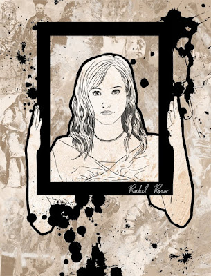
This morning I revised my design from last night. I did a more "finished" looking version for my DeviantART account, in which I found old portraits and woodcuts of people and made them into a textured background (do you see the people? Do you see 'em??). Then I added ink splatters, because ink splatters are the lazy man's answer to a static composition (in other words, it makes the picture flow).

Anyway. The paint splatters looked so much better that I added them to the t-shirt design, too. Enjoy!


Saturday, January 29, 2011

MaD T-Shirts (pt 3)

I know I promised I would put up some real work yesterday, since Thursday I spammed you with Varric Tethras and nasty old artwork. But I suddenly remembered the chapter and quiz that I forgot to do for my Geology class, so that's what I did last night instead of drawing. :/

Another design! This was a little more impromptu. It's an old photo of mine that I came across today and thought might work well. And I think it did. I don't like it as well as the other design visually, but I feel like this one communicates better.

My first design I had a lot of people saying, "Well, what does it mean?" And it's pretty simple, really. A girl laying, daydreaming or something. This one I chose the picture because of the honesty in the expression. And I tried to draw it very honestly. Being a self portrait, it would have been easy to try and make this flattering. But it's not supposed to be beautiful. It's supposed to be truthful. The thing I love about Meg and Dia's music is the incredible honesty that it shows. They're laying their bleeding hearts on the table, and that's pretty rare in today's music industry. So with this picture I tried to match that honesty visually. I hope that it worked.

Thursday, January 27, 2011

Draw Varric Thursday

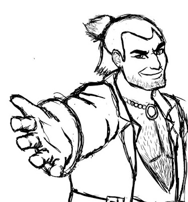
It's Draw Varric Thursday (or Friday, or Saturday) on the Bioware forums in the Varric Tethras appreciation thread. The forums, and in particular that thread, are home to some very talented artists, and seeing their adorable and hilarious renditions of some characters that we mostly know nothing about from a game that doesn't come out for another month makes me want to do a little doodling.

Soo... here's a little something that's pretty different for me. Out of my element and no reference, and not much time for drawing today. In that context, I think it turned out well. It's also fun to draw jaunts like this once in a while.

I leave you with this quote from Mary Kirby, the writer behind Varric Tethras, which just goes to show how awesome the fans in that thread are:

"... holy crap.

Yes, Varric's voice is provided by Brian Bloom.

How the heck did you work that out? You haven't even heard him yet...

*boggles*"


I'll do some real art tomorrow, I promise.

Old artwork.

I am not naturally talented. Some artists are. Some can inherently look at things and draw what they see... not me. I'm a good artist because I've practiced, like any musician or cook or athlete. I have people tell me all the time, "I wish I could draw like that!" Well, five years ago I thought the same thing. And I've put a lot of hard work into getting where I am now.

I was going through my DeviantART scraps to find some old artwork to emphasize this point. The atrocities I found... I had forgotten they even existed.

2005:


2006:


2007:


Also, I was just really entertained by my stupid younger self. I thought I was so cool. *eye roll*

Wednesday, January 26, 2011

MaD T-Shirts (pt 2)

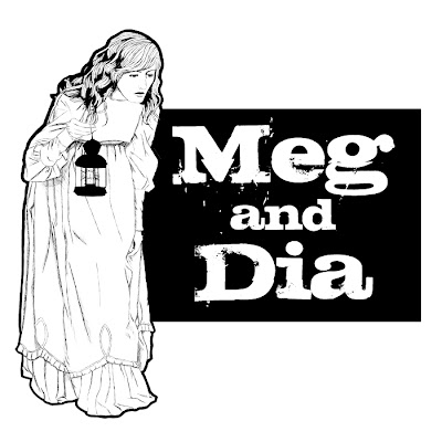
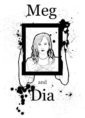
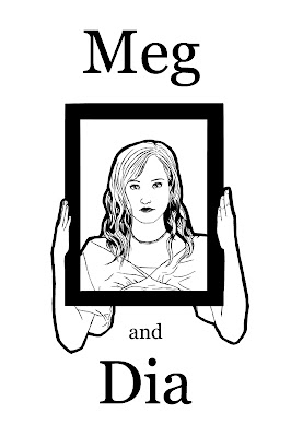
More designs for Meg and Dia t-shirts. I added a little bit to the typography one I presented last time, and I finished the one of a girl laying. Really happy with both. What do you think? Would you wear these on t-shirts?

More to come.

EDIT: Changed some things on the laying down picture. Made it stark black and white as opposed to shades of gray, changed placement of "and", and added a black outline to the figure to make it stand out more. (Bottom image is new.)


Tuesday, January 25, 2011

I was a mermaid in a past life.

That title doesn't even make sense now. It used to, because I had colored my hair in this one, and it was bright red and I looked like Ariel. Not so much anymore.

Anyway, it's me. I did this one intending to try and copycat my friend Ryan, because he has an incredibly beautiful style of linework, but... it failed. And just turned into a really fast sketch. Only about 45 minutes in this one, as opposed to the 3 hours I usually spend on a drawing. Doesn't even look that much like me, but that's my own fault for not investing enough time.

Would have liked to do more drawing today, but most of my free time was eaten up by tedious drawing 1 homework. Seriously. Tedious. I'll have more time to do artistic things tomorrow after my classes are over. Will probably do some MaD related stuff, since I'm having a friend come model some pose ideas for references.

Blargh. Vegetate tiem plz.

Monday, January 24, 2011

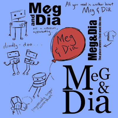
MaD T-Shirt Contest (pt. 1?)

So, Meg and Dia is having a t-shirt design contest. Which caused quite a stir among myself and my two friends.

These are a few ideas I brainstormed for it tonight, the ones on the left featuring Chandler from Meg's jewelry business. My favorite Chandler idea is the big one with the red balloon. Alyce brought up the point that she wasn't sure whether the band would want to use Chandler, since it's a separate entity, but he could always be replaced with an equally adorable robot... or semi-human figure. And of course, the idea of floating away on a balloon with your house disappearing came from "Your feet fly off the pavement / your house a tiny spec of dust" in Less of Me. The others aren't so much potential submissions as figuring out what to draw.

Alyce also suggested that I submit a typography design, since MaD have quite a few, very tasteful, retro typography based shirts. Out of the ideas here, the big one in the bottom right is my favorite. It feels like a classic novel (Alice in Wonderland comes to mind for me, and I thought about including an Alice motif, but I had a mental image of a stick figure Carlo walking up and bitch slapping me. "WE'VE DONE ALICE ALREADY, FOO'!").

... Suffice to say, I left it as it is.

The one on the top left is my least favorite. Something about the tilted E made me think of a cheesy sit com... D:

And I like the idea of text going up the side of the shirt, so that's my second favorite typography.

So those are my first two design ideas, in their rough incarnation (or for the typography, maybe final incarnation). For my last idea, I'm thinking of doing a realism sketch of a girl laying, maybe with a book, and the text "the place where I feel most like me / Meg & Dia" or something. That will be trickier, since I'll probably have to rope one of the girls in the dorm into posing for a reference so I don't have to worry about stock credits.

As for the color, I chose blue because I thought it looked good with all of them, but it could really be replaced with anything light.

Sunday, January 23, 2011

Dwarf chicks can be hot too.

Did I really just draw this?

... Yeah, I guess I did.

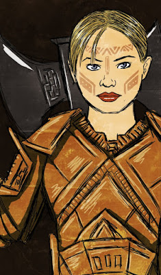
Another video game fan art. This time, for Dragon Age: Origins. The great thing about that RPG is the level of individuality offered to each character. There are six different origins your character can start out from, depending on the race and class that you choose. That aside, whenever I build a character I form a bit of a story and personality for them which may or may not differ from their in game persona (this is especially true of games like Mass Effect, where you can customize the appearance but the voice is always the same and you only have choice of paragon or renegade personality). Building characters in this way you naturally form some attachment to them, and its no wonder you get so many drawings of OCs on the internet.

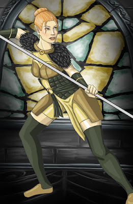
Anyway, this is my dwarf tank, Skadi Aeducan. Daughter of King Endrin Aeducan, she is a princess, but being a princess in a dwarven society ain't prissy (you can't see it in this picture, but her hair isn't pulled back, it's just boyishly short). Naturally, I had to give her some massive armor and a battle axe as big as she is. I really love the Aeducan origin. First of all, Gorim is awesome solely for the fact that he is voiced by Steve Blum. Known for a plethora of roles including Spike Spiegel, Urdnot Wrex, and Vincent Valentine, this man's voice is a close second in sex appeal to Brandon Keener, voice of Garrus Vakarian. Alos, there's nothing quite as dramatic (in a badass kind of way) as being betrayed and left to die in a game of political intrigue. And then showing up a couple months later. "Oh, hey guys. You thought I was dead? Oh, that's cool. Actually, I'm a big damn hero on the surface now."

Long story short, I've been playing Dragon Age, trolling the DA2 forums, and needed to get this out of my system. Same story as Trip from Enslaved.


Other Grey Wardens: Apollo Cousland, Rhea Amell, and Amanali Mahariel.

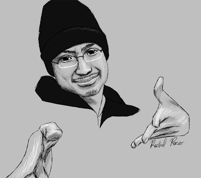
Will

This is another friend from high school. When I saw this picture, I just had to draw it. It was so expressive and captured his personality so well. He's a really nice, energetic guy. I was especially interested in including the hands... they look super weird, but they're there.

Saturday, January 22, 2011

Maddie

Drawing of my friend from high school, Maddie. When I mentioned the possibility of drawing some of my friends on Facebook, she was really enthusiastic. So enjoy, Maddie. :)

I really love her hair. I haven't drawn really curly hair yet, and it was kind of intimidating, but ended up being really fun.

Wednesday, January 19, 2011

Meg goes Steampunk

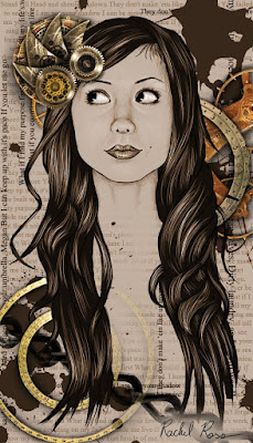
So yesterday I was contacted by Meg Frampton. The awesome Seventeenth Star (Alyce), a mutual friend, had sent my picture to Meg and she loved it, so she contacted me about using it on her blog. However, she felt that it was very feminine and not quite in line with the steampunk style of her jewelry (and I can totally see where she's coming from). She asked me to replace the butterfly with some cogs. Clearly, I went a little further to make the entire image more cohesively steampunk. That said, I think it turned out really well. I'm happy with it, and hope the she is too.

Obviously this is a hybrid of drawing and photomanipulation, since the cogs are all pictures of watch and clock parts that I didn't paint. It was a lot of fun to do. I've always wanted to try a steampunk piece, but never knew quite how to piece things together. Now that I've figured it out a bit, I may do more steampunk in the future.

Tuesday, January 18, 2011

No Death in Love

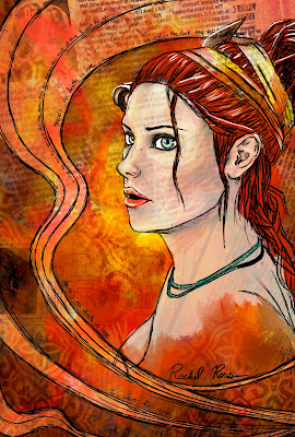
And once again, we have me experimenting stylistically- same sketch, too. Why Trip? I dunno. Because I like Trip, and I haven't gotten Enslaved out of my system yet.

I feel this one was immensely more successful than the disaster I churned out this morning. Obviously a rainbow color scheme isn't the brightest idea. I grabbed myself a copy of The New York Times on the way back from Drawing 1 tonight (perspective and shapes in perspective... UGH) and approached it the way I might have back in AP Art. My teacher was really into collage backgrounds, and let's face it, newspaper texture makes just about anything look better. I also implemented a few ideas spawned from the inspiration pictures I posted yesterday- messy paint, hand drawn designs to lead the eye, and overall a rougher, more painted look. I really like it. I'd like to continue in this direction and see where it leads. And as always, I'd appreciate your thoughts. Even if it's just encouragement, I'd like to see if the world agrees with me. (For those of you from AP, maybe a little Paige here?)
Last note- lyrics come from No Death in Love, from the soundtrack of Enslaved. Beautiful song, totally worth a listen if you have the time.